Gallery 3


IMG-20130212-WA0003

On first visit to The Usher Gallery, we felt gallery 3 had the most potential as a performance space due to its contrast to the other rooms in the building. All the other rooms in The Usher are light, airy and traditionally decorated, whereas gallery 3 is dark, enclosed and contemporary.

We found that there are many fascinating aspects about this particular room, one of which being that the items on display are withheld from their intended purpose because they are in glass cases. The items here are practical but with artistic value, as opposed to other features in the gallery such as the oil paintings and sculptures.

IMG-20130212-WA0009 Left: Tea set collection in Gallery 3

The Usher Gallery as a whole displays many items from James Usher’s personal clock collection, most of which appear in gallery 3. As you enter the room, the first thing you see is the Grandfather clock and the pocket watch collection, this is such a dominant feature in the room that it influenced our ideas for a performance focusing on time, in this space.

IMG-20130212-WA0004Left: Grandfather clock               IMG-20130212-WA0006 Left: Pocket watch collection

The lack of natural light means the only perception of time in the room is from the clocks, this makes it ideal for a performance on time as we can manipulate how time is perceived.

The room is midnight blue colour  and has a very low ceiling creating an enclosed and compact space to work in. The fact it is a room built within a room makes it feel claustrophobic and uncomfortable, which is an aspect we would like the audience to experience whilst watching our piece. The contemporary style of the room is unusual to be in a Georgian building, this intrigued us and was our inspiration to perform here.


The gallery, first encounter…

During my first look at The Collection Gallery I was more intrigued by the architecture of the building than the works contained within it. I liked the idea of using the building to formulate a piece from just looking at the way in which the building was held together.  I want to look more into the way that the architecture affects the uses of the building and how the public view the collection gallery as it stands next to the less modern usher gallery. Does it look out of place? An eyesore? Or is it a beauty in its own right?

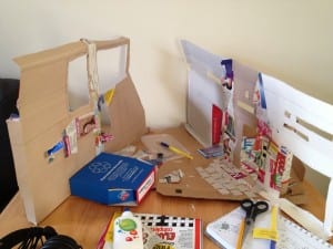
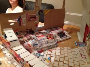
To document my appreciation of the architecture of the gallery I have started to recreate the collection gallery building using cardboard, this allows me to look into the detail of the gallery a lot further in my attempt to recreate it. This will also help with our future ideas as we can use it to build models of our set therefore trying our ideas out before we set off to do it on a much larger scale.

Building the gallery 1


Building the gallery 2

‘Barbara Kirschenblatt-Gimblett makes an even more explicit comparison: ‘exhibitions are fundamentally theatrical, for they are how museums perform the knowledge to create’ (Destination Culture, 1998, p. 3). Traditionally, of course, museums arranged their collections in predictable, linear narratives, committed to organizational categories intended to be definitive’ (Bennett, 2013, pg 4) This quote from Theatre and Museums shows how museums can be seen as theatre as well as exhibits. I agree with this, that an art gallery is theatrical in concept. Performer’s present work, a gallery does exactly the same. I like the idea of a gallery being theatre, I believe it give the visitors a chance to become an audience and view the piece and infer it’s meaning. Art is open to interpretation similar to many Site-Specific performances, this itself is an interesting observation and this has now given me a new view of the gallery and I now feel that I will look at the exhibitions differently upon my next visit to the gallery.

I was particularly interested with the cafe, the architecture within it is beautiful with lots of different layers and levels using different materials to contrast and complement one another. I would like to base a performance in this area as it has natural frames to the place. The windows in the cafe are like big frames to the outside world connecting the frames of the gallery artwork to the space in the cafe. There is one big window that points up towards the cathedral and frames it up on steep hill. I think using the architecture to frame the piece would be a nice way to get the beauty of the building in with the idea of Site-Specific performance.


Bennett, Susan (2013) Theatre and Museums, Basingstoke: Palgrave Macmillan

“An hour and a half”…

Throughout our time in the Usher Gallery, our focus has continuously returned to one of the gallery rooms upstairs and in particular, the painting, ‘The Brayford Pool and Lincoln Cathedral 1858’.

As citizens of Lincoln we were immediately drawn to how the painting illustrated the vast changes between the city we know and the city that once was. We found it interesting to compare the people of the ‘then’ and ‘now’ and how this could be used in our performace. We sat in the gallery for an hour and a half and documented the views and reactions of other visitors, interested as to whether our views were shared with others. There was a commonality between students and the older generation who would both study the painting intently, possibly trying to identify what has changed or familiarising themselves with what used to be.

An important architecutural point that we noticed is the purposful way in which the room was designed so that the influences from the contemporary art gallery parallel are clearly visable from the room in which the traditional paintings are hung. This is a clear passageway from the old to new. This stimulated further ideas on the subject of the progression of art, with the possiblity of hanging a matching image of the Brayford Pool in the twenty first century. What impact would this have on the vistors of the art gallery and would they appreciate the comparison between both images? The clashing of the two different styles of art is something we are becoming interested in exploring rather than blending them together. In context of a site specific performance, a way in which we could achieve this could even be as simple as the use of speech in the Usher Gallery which would break the traditional silence. This is a subtle beginning of our exploration into how we can challenge the boundaries between traditional and contemporary art.


W/b 4/2/13 was the day of play

Our aim for this week was to :

Come up with scenarios for each space, any revelations? What excites us about the space?

This week was an eye opener for us as a group. We explored the possibilities of things to do in each space (some of our ideas can be seen on Daniella’s Blog page).

Whilst looking in to each space, the entire group decided that we were more drawn to the side spaces in the contempary gallery and the symmetrical space found in the museum part of the collection. After much deliberation, we decided that instead of using all five spaces, as originally planned, we would focus on the two spaces that stood out to us the most.

Finally, with our space decided on it was time to incorporate what our period of experimenting had taught us.

From here, we began to use the materials that we had bought to the lesson.

–        Marbles

–        Army Figures

–        Cardboard cups

–        Coloured ducks

–        Bubbles

From the outset, we were aware that we wanted our performance to have a sensory aspect to it. As the space that we were looking in to was located in the contemporary art section of the Collection, we felt that there had to be something that was aesthetically pleasing to the audience, as the room itself is. The marbles were used to make noise, the cardboard cups were used to simulate touch and finally, the bubbles and the coloured rubber ducks were to incorporate something that we felt would engage the audience and create a spectacle for them.

We began this process in the Gallery area one:

013


‘When looking in the main gallery we found inspiration in the Roman centurions reconstruction. What interested us about these figures was that they were small individual objects and collectively they formed an army. From stacking of the cups, we then had the idea of merging the two together and creating a war/ battle field scene.’ – Daniella

From this, we decided to add to the display that we found in the museum, as seen below.

010


011


We then used this idea in the space, incorporating the cardboard cups and the army figures in order to make a spectacle for the audience. It was important to us to show the link between what was being acted out and the space in which the audience found themselves.

031


029


During this process, an installation of a television screen repeating words over a video was playing. As a group, we decided that we thought it was quite effective to have words being spoken over us as we were building. It almost helped us to be engrossed in what we were doing. Because of this, I decided to write a poem.

When the experimental poem was written, we decided to build the war-like scene again with Tequila reading the words over us. When this was done, we discussed how it had made us feel:

Alicia: How did it make you feel?
Daniela: I felt like i had to achieve something, my mind was totally set on building it up.
Tequila: Did me speaking over your actions make a difference?
Ellie: Yes i felt it created a tense atmosphere.
Alicia: Was it therapeutic for you?
D&E: Yes, we were completely involved in the construction, totally unaware of our surroundings.
Tequila: Did you envisage a story?
Daniela: Yes i felt protective over my men! i wanted to win!
Alicia: How did it feel responding to each other?
D&E: We only really paid attention at the end when through body language when we knocked down our towers.


This was an exciting week for us as a group as or ideas and concepts are beginning to come together.

Word Count: 590

The man who married a mountain…

4th February, the collective

This week, we decided to explore further and begin to come up with some genuine ideas for our performance as a piece.

Living and being in the space – we liked the idea of turning back time (inspired by the extensive watch collection found in the usher gallery) and exploring what the building was like when it was the residence of James Usher as opposed to be open to the public.

Ways in which we can find out more about the Usher Gallery as a place of residence:

Local lib

Records

Drawing

Photographs


5

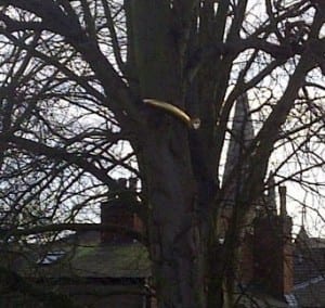
When we came across the piece outside the usher gallery, we inquired as to what it was symbolic of. A member of staff told us that the artist, was inspired by a story about a man who was so in love with a mountain, he wanted to marry it. The artist then took this a step further and planted the engagement ring on a tree located outside the usher gallery in order to portray the concept of the bond between love and nature. We were intrigued as at this point, as we were the only group that had noticed the ring in the tree. It was from this, that we finally felt we were really looking at the space and paying attention to detail as we began to see things around us in a different light. From the ring in the tree (pictured above) we began to look in to the idea of seasons as the ring could only be seen fully when the tree was not in full bloom, i.e in the winter. In comparison, during the summer, when the ring is hidden by all of the leaves on the tree. We felt this could be a potential basis for our work as a group. Here’s what we came up with:


111112


In the summer, when the leaves cover the ring, it is even more hidden and people walk past without knowing that the installation is there.

This is where we arrived at our concept of revelations and the revealing of spaces.


ArcSoft_Image212

See you soon!

Authors: Ellie Henshaw

Word Count: 355